BRAND DEVELOPMENT

Project Objective
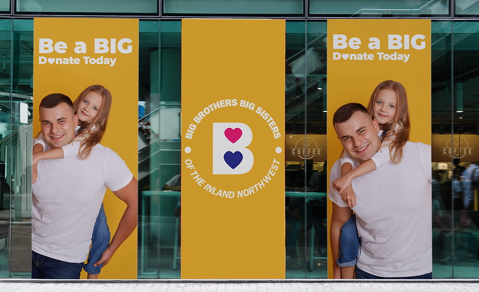
The branding process for Big Brother and Big Sister of the Inland Northwest involved developing a strong and impactful visual identity that embodies the organization's mission of mentorship and community support. Through careful consideration of their target audience and brand strategy, a compelling logo, color palette, and storefront design were created to effectively communicate their values and attract attention.
The Story
The Problem
The design problem for Big Brother and Big Sister of the Inland Northwest's kiosk involved creating a new logo identity and ad campaign that would effectively represent the brand and resonate with the target audience. The solution involved designing a modern and dynamic logo that combined elements of mentorship and community, using vibrant colors and friendly typography. The ad campaign focused on showcasing the positive impact of mentorship through compelling visuals and real-life success stories, aiming to inspire and attract
potential mentors and supporters.
Advertisement

Logo Identity

Main Logo
Alternative Logo

Color Palette

The Marketing Stragedy
The design process strategy for building out the kiosk and store front design of Big Brother and Big Sister of the Inland Northwest focused on creating a visually appealing and welcoming space that aligns with the organization's brand identity. This involved incorporating the brand colors and logo prominently in the design, using clear and concise signage to convey the organization's mission, and ensuring the layout is conducive to easy navigation and engagement with visitors. The overall goal was to create an inviting and memorable experience that reflects the values of mentorship and community support.


